ATL Scoop Mobile App Design
Mobile news application
Mobile news application
June 2024-July2024
Lead UX/UI designer
Creating digital wireframes, low and high-fidelity prototypes, accounting for accessibility, and iterating on designs.
ATLScoop wants to turn its Instagram profile into the central mobile news application for Atlanta residents that will provide users with the latest news stories happening around the city.
*How do we turn a social media profile into a mobile news app that engages users, provides a simple user experience, and reflects ATLScoop’s brand?
Design an app that reflects ATLScoop's brand and audience
Provide users with features essential to a news application
Provide users with an easy user flow
To pinpoint the needs of future users, I went through the posts on their Instagram page. While doing so, I jotted down the types of stories and news updates they post and how their followers engage with their content to find insights on what to focus on for the app design.
Users on ATLScoop are provided with traffic news, events in the city, crime stories, and much more.
Results: Users will be able to filter what stories they want to read about.
Followers of ATLScoop’s Instagram profile engage the most with the site through their stories posted throughout the day that they share about things they see throughout the day in the city.
Results: Users will be able to view stories of moments in the city posted throughout the day.
Although ATLScoop’s Instagram profile focuses on Atlanta, it doesn’t provide a mobile-friendly way for the news profile to fully deliver Atlanta to its audience.
Results: ATLScoop’s mobile app design will reflect Atlanta’s culture and ATLScoop’s brand, as well as have a clear and concise structure.
ATLScoop aimed to show users Atlanta stories and culture through the lenses of a mobile phone. I aimed to do this by creating a UI Design Style that was cohesive to this goal while adhering to the readability and versatility needed to be a news application for the new age.
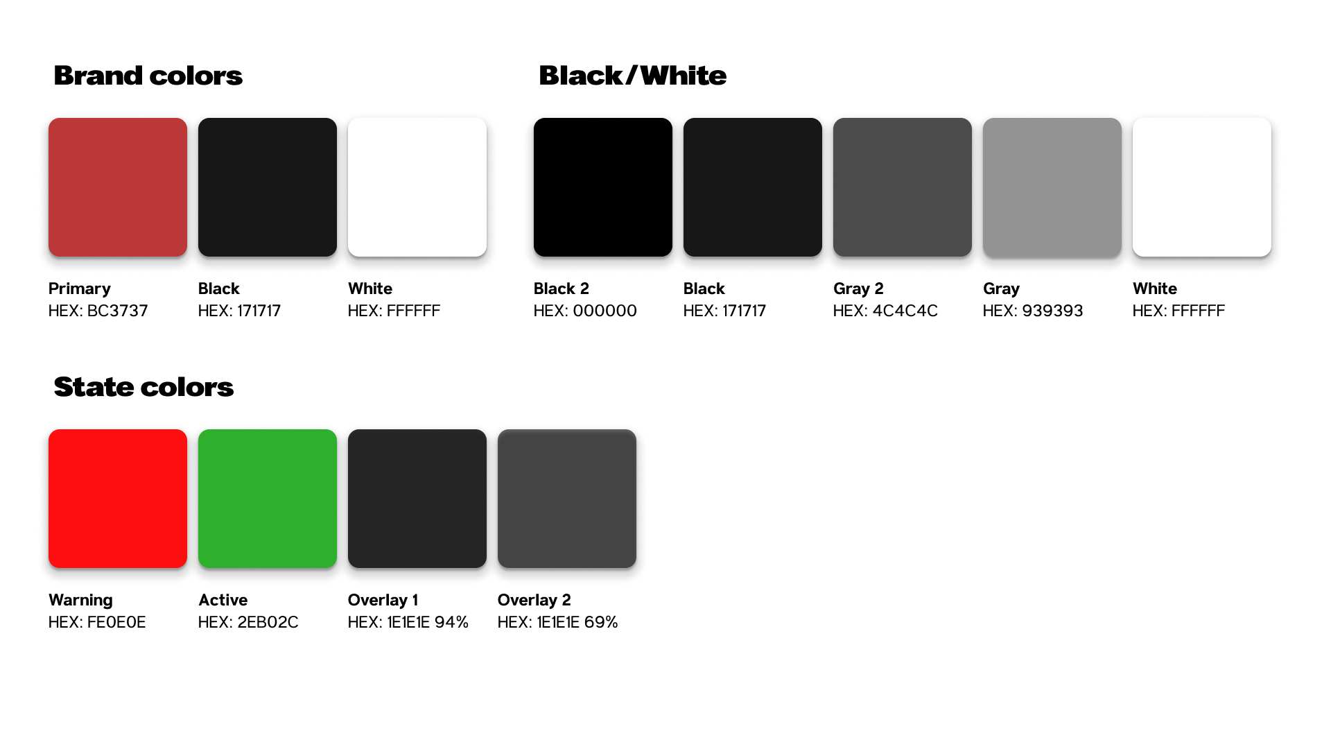
ATL Scoop UI Design KitThe design's color scheme focused on choosing a readable shade of red alongside black, representing Atlanta and commonly seen in many of the city's sports teams.
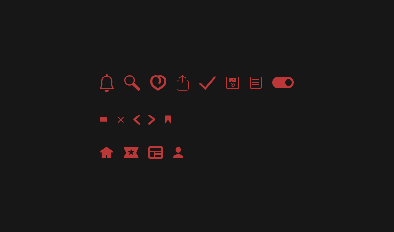
I decided to design the icons as a challenge for myself as a UI designer and to give the app an original style. I gave the icons a minimal, round, and flat style.
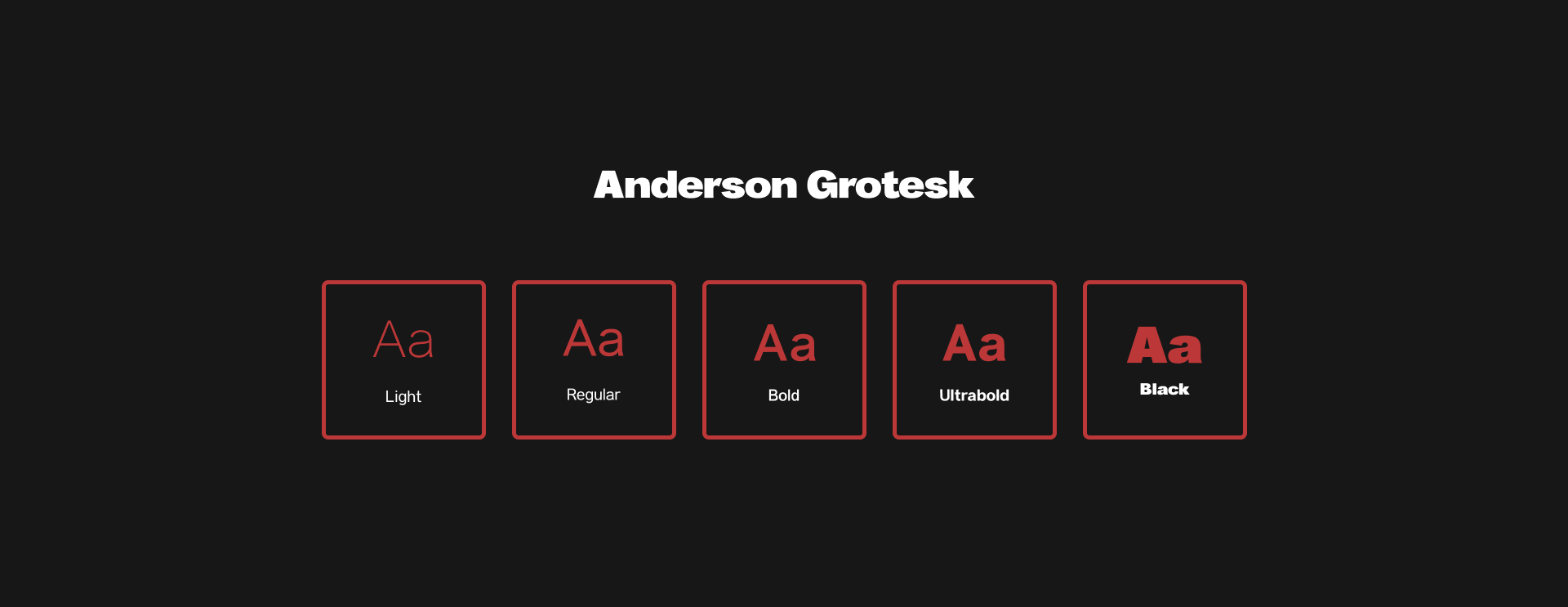
Selected Anderson Grotesk for its high legibility, clean and minimalist design, and contemporary, streamlined look.
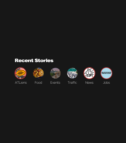
A stories bar was implemented into the homepage for users to access.

The accessibility tools used for the mobile application are centered around typical issues that address certain users but could also be useful for all.
Font Size Adjustment: This setting option was created to allow those with readability issues to see the text in larger or smaller sizes.
A reader view was added to the news article page to help users focus more effectively on the content.
A text-to-speech button was added to the news articles on the page to assist individuals with reading difficulties.
Additions and changes to the application’s design were applied to the prototype due to findings from user testing.
I removed the tab bar and highlighted the latest, for you, and trending categories within the listed articles. I added a card section below for the other browsable categories available to enhance the homepage appearance even more.
Settings options were made available on the profile page to allow users to personalize their experience. Users would now access their notifications in the header.
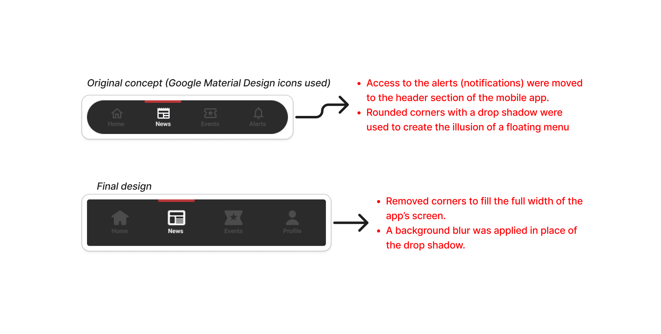
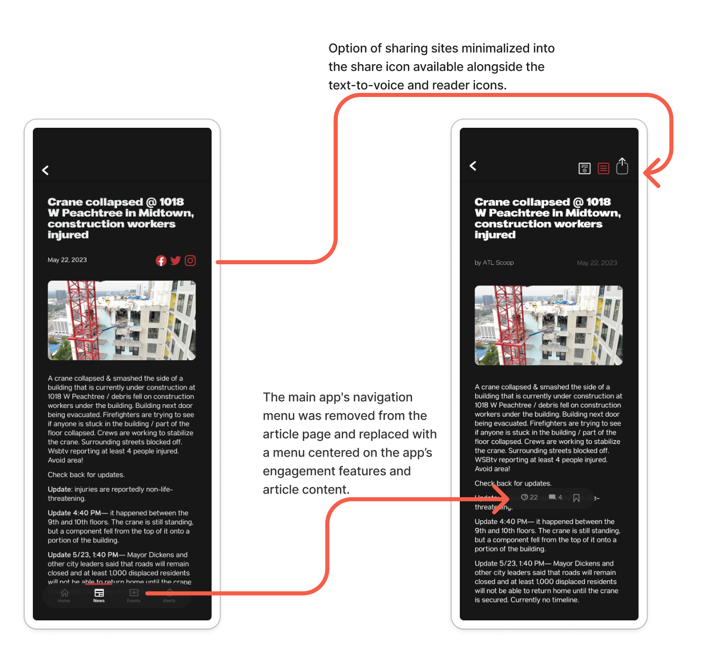
Icons for sharing on various social sites were removed from near the article title and replaced with a share icon in the header for easier access. A new navigation bar, fixed to the bottom of the page, was added to allow users to comment, like, and bookmark articles.
Onboarding UI was created to give users insight into how to operate the app and its features. Also allowed users to personalize a few of the most important settings.
The development of the mobile news application focused on delivering a user-centered, seamless experience that enhances readability, accessibility, and engagement. The next steps would be adding key features such as designing UI for notifications, offline reading, and support for multiple languages.